Thursday, 23 January 2014

Thursday, 9 January 2014
Evaluation 4 - How did you use media technologies in the construction and research, planning and evaluation stages?
Throughout the making of my evaluation answers, I have also used an application on my iPhone 4 called the 'Dragon Dictation' app. This app allowed me to say the words I wanted to put into my essays, without typing. This technology allowed me to save a great deal of time when making my evaluation questions as all I had to do was speak the information out loud. I found this app easy to use, and all I had to do was to check over my spelling, make sure the words were correct, and add any punctuation I needed to add..
.jpg)

This media technology was something that I had not discovered at the beginning of my advanced portfolio, however, it has helped me dramatically throughout the evaluation questions.
Evaluation 3 - What have you learnt from audience feedback?
Audience feedback was very important when making my magazine, poster and film trailer. To receive this feedback I made sure I asked my own target audience, and not someone else who would not fit the characteristics. My target audience had to be interested in film noir, they had to be aged between 15 and 30, and they could be of any sex. I chose to talk to my class mate Ryan about my film, because he simply fitted these characteristics. I created a voxpop to store this information on my blog. By choosing to use a voxpop, I was able to watch the video back over as many times as I wanted without having to read anything. I could also skip to different questions in the video, to hear the answers.

The questions I asked Ryan were recorded on my blog, just in case I wanted to ask these questions again, or just in case I wanted to re read over the information asked. I found it easy to make a voxpop because I could use the smaller flip cameras. This made it easy for me because I simply had to click one button, and I could watch over the film there and then to make sure he answered the question clearly, by using useful information. A voxpop was easy to upload to my blog, because of the way I could use the USB extension which was attached to the flip camera itself.
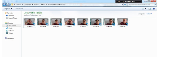
Above, I have screen shotted the vox pop vidoes. This is to show you how easy it was to upload these videos from the flip camera. I could then watch the individual clips, in order to decide which ones would be usedful to me. I made sure that I made individual videos for each question. This then meant that if either one of us made a mistake, we could simply delete that video, and retake it to make it perfect. Even though it seems that Ryan answered the questions spontaneously, we did speak about his answers before I filmed him. This allowed me to make sure he had a good amount of feedback, in order for me to act upon it.
Audience feedback allowed me to see the mistakes I had made, that I had missed. It allowed me to check over spelling and to make sure that everything was in place correctly. Along with this, I was able to see what other people thought of my magazine, poster and trailer. By receiving this feedback, I could take on other peoples ideas, and maybe consider changing things. As I was asking members of my target audience, I knew that if I changed things to suit one persons needs, it would probably apply to the other members of the target audience (as they like the same things). By listening to this feedback, I was able to make sure my final products came out at the best standard for what I was intending to create.

Above, is a picture of Ryan. He is 19 years of age and enjoys watching film noir films, aslong as they include aspects of action within them. He enjoys watching action films because of the suspense created and the constant drama created throughout the film.
It did not matter whether my target audience choice was male
or female, because my target audience is actually both. However on this
occasion, I chose Ryan because he said he did like the theme of film noir. Film
noir could be seen as old fashioned, however because of films like ‘Drive’, we
can now see how film noir is included in more modernised films. This is the
type of film Ryan would like to watch, because of the way film noir is
modernised, and also the amount of action is high.

Above, I have screen shotted the vox pop vidoes. This is to show you how easy it was to upload these videos from the flip camera. I could then watch the individual clips, in order to decide which ones would be usedful to me. I made sure that I made individual videos for each question. This then meant that if either one of us made a mistake, we could simply delete that video, and retake it to make it perfect. Even though it seems that Ryan answered the questions spontaneously, we did speak about his answers before I filmed him. This allowed me to make sure he had a good amount of feedback, in order for me to act upon it.
Audience feedback allowed me to see the mistakes I had made, that I had missed. It allowed me to check over spelling and to make sure that everything was in place correctly. Along with this, I was able to see what other people thought of my magazine, poster and trailer. By receiving this feedback, I could take on other peoples ideas, and maybe consider changing things. As I was asking members of my target audience, I knew that if I changed things to suit one persons needs, it would probably apply to the other members of the target audience (as they like the same things). By listening to this feedback, I was able to make sure my final products came out at the best standard for what I was intending to create.
Above, is a video of feedback we received from other people in
the target audience. These are people in our class. We showed them our plans
for the film trailer we are going to make, and they responded by telling us
their thoughts. They gave me a very wide variety of constructive feedback, as they commented on what they liked and disliked about my trailer plan. It seemed that Ryan (left) thought that the trailer would much more like a horror movie if we had the 'hand over Susanna's mouth' idea. Therefore, we took this part out and changed it for a scene where Susanna is tied up. This meant that the audience were left to think about what would happen to her, rather then allowing them to see her get physically hurt. I took this advice on board and made my film trailer as an improved version because of this.
I found it easy to create this video as I just had to film my class mates speaking about my film trailer. This was the first time they had seen the plan for my film trailer. I thought it would be a good idea to film them as soon as they saw it because it makes it easier for me to see their immediate reaction.
I found out that there was a lot of things my target audience liked about my film trailer. This therefore meant that I would leave these aspects in, and create the film trailer as I had planned. This feedback was received before we started filming. The students are watching and animated storyboard on the screen at the front of the classroom. Because of this, it meant that I did not have to change things on the filmed clips, because we had not started filming them. It meant that I did not have to totally rearrange my trailer, because the trailer was not made. I think this is a good thing because it saved me a lot of time compared to how long it would have took if I had already made the trailer.
Me and Steph had a fair idea of what we would like our trailer to be like, and that is what made it easy to create this story board. As the storyboard is on my blog, it meant that I could look back over it, and find the bits which they commented on. I will be keeping the storyboard on my bog because it is a very defined contrast between the film trailer and the storyboard itself. This is because of the dramatic changes we have made to the storyboard.
I found it easy to create this video as I just had to film my class mates speaking about my film trailer. This was the first time they had seen the plan for my film trailer. I thought it would be a good idea to film them as soon as they saw it because it makes it easier for me to see their immediate reaction.
I found out that there was a lot of things my target audience liked about my film trailer. This therefore meant that I would leave these aspects in, and create the film trailer as I had planned. This feedback was received before we started filming. The students are watching and animated storyboard on the screen at the front of the classroom. Because of this, it meant that I did not have to change things on the filmed clips, because we had not started filming them. It meant that I did not have to totally rearrange my trailer, because the trailer was not made. I think this is a good thing because it saved me a lot of time compared to how long it would have took if I had already made the trailer.
Me and Steph had a fair idea of what we would like our trailer to be like, and that is what made it easy to create this story board. As the storyboard is on my blog, it meant that I could look back over it, and find the bits which they commented on. I will be keeping the storyboard on my bog because it is a very defined contrast between the film trailer and the storyboard itself. This is because of the dramatic changes we have made to the storyboard.
Evaluation 2 - How effective is the combination of your main product and ancillary texts?
The combination of my main product and my ancillary texts are vital for showing the similarities between them. This makes my products look professional because of the way they are linked and show similarities. It means that the audience instantly know how the products are linked together. Things like the font, colours, and photos are all similar to one another.
The genre of my film magazine, poster and film trailer was something I needed to think carefully about, to ensure that my target audience was addressed. The way I used the colours black, white and red, instantly connoted the theme of the unknown, danger and contrast between emotions and contrast itself. This allowed my audience to know it was aimed at them.
The genre of my film magazine, poster and film trailer was something I needed to think carefully about, to ensure that my target audience was addressed. The way I used the colours black, white and red, instantly connoted the theme of the unknown, danger and contrast between emotions and contrast itself. This allowed my audience to know it was aimed at them.
The
colour black represents the unknown the colour red represents danger and the
colour white was a contrast between the black and the red. This allowed my text
to stand out on my magazine my poster and my film trailer. I also chose these
colours because they are linked to film noir.


The font was the same throughout. It started in quite a bold font which allowed
it to stand out of the page. I also added a drop shadow to my font this meant
that it's stood out even more to the audience. The drop shadow was something I
added on photo shop this was a useful tool and was very creative for me to
have. Photo shop was easy for me to use as hat I had used it before in my AS
coursework. I continued to use its features throughout my A2 coursework. Using
the same font made my work look more professional and inviting to the
audience's eye. Overall I think the three products I have created linked
together well because of the font.


 We left our production name on all three of our products, this allowed the
audience to instantly know who had created this product. We thought this would
be a good idea because it attracted to the audience's attention and told them
who the production company was this would therefore allow them to know how good
the production company was in contrast with other films they had made
previously. If the production company was a famous production company the
audience would instantly want to see the film because of other successful films
they had made in the past.


 Another example of continuity throughout all our products would be the way
characters we kept the same throughout, which meant that all three products
were linked directly. This allows the audience to understand the storyline more
effectively.
Evaluation 1 - In what ways does your media product use, develop or challenge forms and conventions of real media products?

This is the masthead that has been used on our magazine which I created. The text is in a bold, white style on top of the black background. This is good because it stands out immediately to the audience. Similarly to this, I have put a scene in the trailer with a black and white colour over the top. This is because of film noir and the black and white connotations. Just like that, film noir is recognised here.
The term ‘SilveScreen’ suggests that the magazine is more of an old classic, rather than a new up and coming magazine. This is a positive aspect because of the way it will appear more trustworthy and worth reading to the audience. This could be because the audience will trust the information more considering it is an old classic.
At the very top of the magazine, I have used a white bar to show the black writing in front of it. This writing tells the audience the date, issue number an price of the magazine. This is a simple common connotation of a magazine. I have used this to show how the magazine is actually a professional magazine.


This is the section of my magazine page which holds the
title of my film. I have kept the title in capital letters, which are red and
bold. This allows the audience to see the name straight away as the red
contrasts well with the black and white background. I have also left a drop
shadow on the letters. This allows the magazine text to stand out from the
page. It allows the text to look more illuminated and clearer to the eye. Below this, I have used a tag line in white,
bold letters. Just as the title does, this stands out well to the audience. I
got feedback on this and the target audience member said they liked the way the
font was used. This was because it stands out well and, looks professional.
This is similar to other magazines like the title on ‘Empire’ magazine.
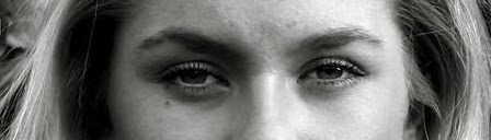
On this section of my magazine, I made sure that the female
had direct address with the audience. This catches the audience’s attention as
they are looking at the magazine; however it also tells the audience a lot
about this character. Here, this woman looks like she is quite in control and
powerful, which is what we wanted the audience to expect, until they see the
film. After seeing the film, they would realise that this is the opposite of
this woman’s behavior. The way which the woman is looking into the camera, as
she is stood with bushes behind her, May suggests that she is looking for some
sort of help as she may be in danger. Here the woman does not look like she is
worried, which is the subvert of what actually happens.
Overall, the reason I decided to show the woman with direct
address was to allow the audience to feel more involvement with the film. This
adds to the verisimilitude of the film, and makes it seem more realistic to the
audience.
in the film trailer we have used different accounts of direct address. This also helps the audience to engage with the film we have made. We used this direct address from Susanna and other character members. It shows the audience that they are involved with the film. On the other hand, we have many shots of characters looking away from the camera. This allows the audience to think about the unknown, and what is not featured and read through the eyes of the characters.
in the film trailer we have used different accounts of direct address. This also helps the audience to engage with the film we have made. We used this direct address from Susanna and other character members. It shows the audience that they are involved with the film. On the other hand, we have many shots of characters looking away from the camera. This allows the audience to think about the unknown, and what is not featured and read through the eyes of the characters.

I have included a bar code on my magazine. This is typically something you would expect to see on the front cover of a magazine for the shops benefit, but also to show the audience that it is in fact a magazine. Along side the picture of my bar code, is a bar code which is positioned on the bottom corner of 'Empire' magazine. This just shows that magazines do include these bar codes on the front cover of professional magazines.

Here, I have screen shotted my screen to show you the separate
clips of my trailer. These are clips from the actual film itself. This shows
you how I have filmed each of the clips individually and moved them around
together to create a trailer. The clips were filmed with our canon camera, this
was easy to do because we could film them individually, which meant we had more
time to re take any shots (instead of just filming all in one go).
Different individual clips would have been filmed for
different movies, by using the same format I used. They would have taken
different clips from the film, and moved them around to make a trailer. I took
this idea from other films that have been made as it is the easiest way to make
a trailer.
The editing was done by myself, however, we did not film the
clips in the same order to what they are on the screen. This is because we did
not need to film them in order. The clips are not put together in the regular
order on the trailer either. This keeps the audience interested as they do not
know the storyline exactly. It adds excitement to the trailer because the
audience do not know what is about to happen next, or what has happened
previously.
Many film trailers will not show the film in order because
they also like to keep the audience interested in the information. This is
exactly the same way as I have created my film trailer.


Above, I have inserted a picture of Gareth, who plays Terrance in our film trailer. It is clear that he is sat around a table with other males, drinking and talking. This shows the audience that the men are talking business. They know this because of the mise en scene and the camera angles included. For example, all the males are wearing suits and ties. This allows us to see how professional the males are. Terrance is also wearing a pair of black gloves which may suggest that he is being secretive about his identity by hiding his fingerprints.
The camera is set at a low angle, which is looking up on the male. This allows us to see the dominance of Terrance and the males he is with. It gives the audience a sense of authority that Terrance has over the audience or anyone else involved in the story-line.
This is similar to the clip from reservoir dogs. This is exactly where we got the inspiration from, The way the camera looking up at the characters in reservoir dogs, makes the males look like they are in control. The males are wearing similar outfits to the ones we used when filming our males. We tried to make our film trailer very much like reservoir dogs, as it is very well known for certain scenes using certain camera angles.


This is the poster Steph has made (instantly above). Above that is a poster from the film drive. As you can see she has created this poster which shows many conventions of a film poster. For example, the credit block at the bottom of the page is very similar to the one seen on the Drive poster. Having a credit block is a good way of drawing in the audiences attentions because it can include names of actors and actresses that have been seen in the film. This can be a main selling point of the film because there is a very wide range of people who will go to see a film because of who is featured in it. Steph has included my name and Gareth's name because we are the two main characters.
Our poster also tells the audience exactly who made the film 'Stem productions'. Just like the credit block and the actors / actresses names, this can be a main selling point to the audience. Wen they see 'stem productions' they will think of other films this company has made in the past, which will therefor encourage them to watch this film.
Our poster also tells the audience exactly who made the film 'Stem productions'. Just like the credit block and the actors / actresses names, this can be a main selling point to the audience. Wen they see 'stem productions' they will think of other films this company has made in the past, which will therefor encourage them to watch this film.


Wednesday, 8 January 2014

Wednesday, 18 December 2013
My poster ideas

This is a simple mock up I have made in the past when
thinking about poster ideas. I liked this photo because of the way she is
looking down towards the floor. It makes Susanna look vulnerable and dependent
on others. I also liked the way that we have stuck to using the red, black and
white colours here. This links the poster with the magazine and the film
trailer itself. I understand that it is Steph’s job to make the poster, however
I am going to suggest that we use this photo instead because of all the
positives of it. Another positive of this photo would be that fact that it is clearly
in focus.
I will make sure that a credit block is present on the
poster. This allows the piece to look much more like a poster, however it also
allows the audience to see the actors and actresses in this film. When they see
these names, along with the editors name, they will want to see the film even
more because they know that this film will not disappoint – all because of the
fame the people mentioned will have.
Poster Progress

By editing this photo onto the poster, we are allowing Susanna to look even more voulnrable.

This is the poster Steph has now created. I think it is good to have this shadow as it connotes the fact Susanna is quite alone and unable to defend herself or hide due to the people constantly being around her in the shadows. I also like the colours red and black and white because they are the same as my magazine colours. These colours are in fact EXACT because of the way we matched them on photoshop.

This is the photo we have started with, Steph will edit, crop and cut out Susanna from this picture and place it within the poster, however she is still deciding on how to do this. I believed this picture, compared to her direct contact with the camera, allows the poster to portray the vulnerability of Susanna and how the male shadow is in control.

Magazine

I asked a male student who is aged 17 about my magazine. I
asked him 6 different questions in order to get feedback to make improvements.
1.
What do you think of the font?
I like the font because it is clear and makes the magazine
look professional. I think it also links with the film well as it looks like
the genre (as you would expect).
2.
What age group do you think this is aimed at?
I think this is aimed at 15+. I found this hard to tell,
however because I think this magazine shows a film noir film, I think it should
be over 15. This is because most noir films are certificated over 15.
3.
What genre of film do you think this is?
I think it is clear that this magazine is a mainstream
magazine, showing a film noir film. I believe this is film noir because of the
way the picture is in black and white, and the background includes trees and a
woodland theme. This connotes the scary theme within film noir because of the
way the girl is positions among these bushes. It also may show how someone is
watching or looking in on the female (another aspect we would see in film
noir).
4.
What do you think of the photo?
I really like this photo. This is because of the clear
direct address. I noticed that the photo was position higher on your first mock
up magazine, which did not look right. I agree that it was right to change this
and to bring the photo lower down. This is because it allows the characters
eyes to be looking directly into the eyes of the audience. You have clearly
followed the rule of thirds here by keeping the girls eyes central in the
middle third. This is good because it is the first place the audience look when
glancing at the magazine.
5.
What do you think of the structure and layout?
I love the way that the writing is position around the characters
face, it makes it look neat, tidy and shows the fact that you have considered
this carefully without making the magazine look untidy. You have made sure that
the masthead is shown to the audience clearly and you’ve made sure that it is
not covered by the photo, this is s good thing because it allows the audience
to know exactly what the make of magazine it is.
6.
What do you think of the text choice (lexical choice)?
I think by using words such as ‘Exclusive’ and ‘star’ we are
able to see the excitement in this magazine. It makes the audience think that
they must read this magazine because they are not going to find any of this
information anywhere else. It makes the magazine seem independent and full of
the most interesting information.
Thursday, 12 December 2013
Update on tasks
I am currently working on the editing of the film. I am using the Apple Mac
to do this. I have had to spend some time to work out how to use this because I
have never used this software before, and I am working alone on this. I
understand that I have the storyboards to look at when making this, however we
have changed our ideas a lot, meaning that the storyboard has changed in many
vast ways over the planning process.
All of the filming has been completed, now we just need to add the soundtrack and organise the trailer.
All of the filming has been completed, now we just need to add the soundtrack and organise the trailer.
Wednesday, 11 December 2013
Magazine

This is a picture of the magazine I have created. I am aware that things need to be changed to this, depending on what the target audience think of it. I decided to use the black and white colour on the photos to connote the fact that this film is a film noir film. I have also used red and white writing on this black and white back ground so that the colours are linked together. I got this inspiration from other magazine fronts covers as the colours (red, black and white) seem to work together very well.
Below, is a photo of the front cover of 'Empire' magazine. This is a good example of a magazine which has used the colours red, black and white. This allows the audience to feel more engaged with the page because of the way the colours work well together, allowing things to stand out without making it look less professional.

Different to this
magazine, our title is in front of the picture. This is because our magazine
may not be as well-known as the leading film magazine 'Empire'. Apart from
this, I think these too magazine are quite similar, simply because of the way I
was inspired by the layout and choices made to create this.
I think I should show
my magazine front cover to someone of my target audience. This will allow me to
get feedback from different people, meaning that I will know where my strong
and weak points are. I will then be able to change the weak points in order to
make my magazine more professional and engaging towards the audience.
Wednesday, 4 December 2013
Poster Mock Up

This is the poster mock up that Steph has created. She has
decided to put the picture in black and white because of the way it links with
film noir, and connotes the theme of the unknown. We also decided to have the
red colour of the text to connote the fact that someone in the film is or can
be quite dangerous.
Update and changed synopsis
We have spent a great amount of time filming our movie trailer. We are currently making posters and magazine front covers. Whilst Steph is doing this, I am spending my time editing the shots we have taken to create the film trailer.
We decided to change our synopsis according to the changes we have made to the plans of our trailer.
Synopsis
Susanna is a young, attractive female who is being tortured by a re-occurring dream she is having of herself being chased by an unknown figure. She meets a mysterious, handsome man who pays very keen interest into her dream. She is flattered by his charm but little does Susanna know that people aren't always what they seem.
Synopsis
Susanna is a young, attractive female who is being tortured by a re-occurring dream she is having of herself being chased by an unknown figure. She meets a mysterious, handsome man who pays very keen interest into her dream. She is flattered by his charm but little does Susanna know that people aren't always what they seem.
Monday, 25 November 2013
Modified Storyboard
We have decided to change parts of the scene. This is the new update café scene. Today is the day we wish to get this filmed in order to have all the filming done and ready for editing!

Voxpop feedback
Here is a rough idea of our poster after hearing feedback from our peers. We deceided to have a close up on my face as after all, I is the main character in the film. However, instead of Susanna hugging into Terrance, there is a black figure in the backgroud to convey there is someone watching her every move. To bring out more features of film noir, we decided that their should be smoke around the characters to convey the gangsters presence and the title writing will be formed from the smoke. Therefore this idea, does not show a romance but a mistery, it shows the main character, the smoke makes the film mysterious and the writing no longer looks femine but creative.
This is an idea Steph had from the feeback

This is an idea Steph had from the feeback

Tuesday, 19 November 2013
Thursday, 14 November 2013
Subscribe to:
Posts (Atom)