
This is the masthead that has been used on our magazine which I created. The text is in a bold, white style on top of the black background. This is good because it stands out immediately to the audience. Similarly to this, I have put a scene in the trailer with a black and white colour over the top. This is because of film noir and the black and white connotations. Just like that, film noir is recognised here.
The term ‘SilveScreen’ suggests that the magazine is more of an old classic, rather than a new up and coming magazine. This is a positive aspect because of the way it will appear more trustworthy and worth reading to the audience. This could be because the audience will trust the information more considering it is an old classic.
At the very top of the magazine, I have used a white bar to show the black writing in front of it. This writing tells the audience the date, issue number an price of the magazine. This is a simple common connotation of a magazine. I have used this to show how the magazine is actually a professional magazine.


This is the section of my magazine page which holds the
title of my film. I have kept the title in capital letters, which are red and
bold. This allows the audience to see the name straight away as the red
contrasts well with the black and white background. I have also left a drop
shadow on the letters. This allows the magazine text to stand out from the
page. It allows the text to look more illuminated and clearer to the eye. Below this, I have used a tag line in white,
bold letters. Just as the title does, this stands out well to the audience. I
got feedback on this and the target audience member said they liked the way the
font was used. This was because it stands out well and, looks professional.
This is similar to other magazines like the title on ‘Empire’ magazine.
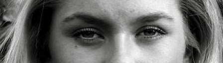
On this section of my magazine, I made sure that the female
had direct address with the audience. This catches the audience’s attention as
they are looking at the magazine; however it also tells the audience a lot
about this character. Here, this woman looks like she is quite in control and
powerful, which is what we wanted the audience to expect, until they see the
film. After seeing the film, they would realise that this is the opposite of
this woman’s behavior. The way which the woman is looking into the camera, as
she is stood with bushes behind her, May suggests that she is looking for some
sort of help as she may be in danger. Here the woman does not look like she is
worried, which is the subvert of what actually happens.
Overall, the reason I decided to show the woman with direct
address was to allow the audience to feel more involvement with the film. This
adds to the verisimilitude of the film, and makes it seem more realistic to the
audience.
in the film trailer we have used different accounts of direct address. This also helps the audience to engage with the film we have made. We used this direct address from Susanna and other character members. It shows the audience that they are involved with the film. On the other hand, we have many shots of characters looking away from the camera. This allows the audience to think about the unknown, and what is not featured and read through the eyes of the characters.
in the film trailer we have used different accounts of direct address. This also helps the audience to engage with the film we have made. We used this direct address from Susanna and other character members. It shows the audience that they are involved with the film. On the other hand, we have many shots of characters looking away from the camera. This allows the audience to think about the unknown, and what is not featured and read through the eyes of the characters.

I have included a bar code on my magazine. This is typically something you would expect to see on the front cover of a magazine for the shops benefit, but also to show the audience that it is in fact a magazine. Along side the picture of my bar code, is a bar code which is positioned on the bottom corner of 'Empire' magazine. This just shows that magazines do include these bar codes on the front cover of professional magazines.

Here, I have screen shotted my screen to show you the separate
clips of my trailer. These are clips from the actual film itself. This shows
you how I have filmed each of the clips individually and moved them around
together to create a trailer. The clips were filmed with our canon camera, this
was easy to do because we could film them individually, which meant we had more
time to re take any shots (instead of just filming all in one go).
Different individual clips would have been filmed for
different movies, by using the same format I used. They would have taken
different clips from the film, and moved them around to make a trailer. I took
this idea from other films that have been made as it is the easiest way to make
a trailer.
The editing was done by myself, however, we did not film the
clips in the same order to what they are on the screen. This is because we did
not need to film them in order. The clips are not put together in the regular
order on the trailer either. This keeps the audience interested as they do not
know the storyline exactly. It adds excitement to the trailer because the
audience do not know what is about to happen next, or what has happened
previously.
Many film trailers will not show the film in order because
they also like to keep the audience interested in the information. This is
exactly the same way as I have created my film trailer.


Above, I have inserted a picture of Gareth, who plays Terrance in our film trailer. It is clear that he is sat around a table with other males, drinking and talking. This shows the audience that the men are talking business. They know this because of the mise en scene and the camera angles included. For example, all the males are wearing suits and ties. This allows us to see how professional the males are. Terrance is also wearing a pair of black gloves which may suggest that he is being secretive about his identity by hiding his fingerprints.
The camera is set at a low angle, which is looking up on the male. This allows us to see the dominance of Terrance and the males he is with. It gives the audience a sense of authority that Terrance has over the audience or anyone else involved in the story-line.
This is similar to the clip from reservoir dogs. This is exactly where we got the inspiration from, The way the camera looking up at the characters in reservoir dogs, makes the males look like they are in control. The males are wearing similar outfits to the ones we used when filming our males. We tried to make our film trailer very much like reservoir dogs, as it is very well known for certain scenes using certain camera angles.


This is the poster Steph has made (instantly above). Above that is a poster from the film drive. As you can see she has created this poster which shows many conventions of a film poster. For example, the credit block at the bottom of the page is very similar to the one seen on the Drive poster. Having a credit block is a good way of drawing in the audiences attentions because it can include names of actors and actresses that have been seen in the film. This can be a main selling point of the film because there is a very wide range of people who will go to see a film because of who is featured in it. Steph has included my name and Gareth's name because we are the two main characters.
Our poster also tells the audience exactly who made the film 'Stem productions'. Just like the credit block and the actors / actresses names, this can be a main selling point to the audience. Wen they see 'stem productions' they will think of other films this company has made in the past, which will therefor encourage them to watch this film.
Our poster also tells the audience exactly who made the film 'Stem productions'. Just like the credit block and the actors / actresses names, this can be a main selling point to the audience. Wen they see 'stem productions' they will think of other films this company has made in the past, which will therefor encourage them to watch this film.
Make sure you are referring back to which CONVENTIONS you have used; the codes of the different format, narrative structure, camera angle, layout, use of rule of thirds, etc and relate this back to how that appealed to the audience.
ReplyDeleteThis response is tending toward describing what you have done, rather than how your using the conventions has helped your construction, whether that's audience recognition of the familiar, a USP for your product or creating an enigma for the audience to solve.