I asked a male student who is aged 17 about my magazine. I
asked him 6 different questions in order to get feedback to make improvements.
1.
What do you think of the font?
I like the font because it is clear and makes the magazine
look professional. I think it also links with the film well as it looks like
the genre (as you would expect).
2.
What age group do you think this is aimed at?
I think this is aimed at 15+. I found this hard to tell,
however because I think this magazine shows a film noir film, I think it should
be over 15. This is because most noir films are certificated over 15.
3.
What genre of film do you think this is?
I think it is clear that this magazine is a mainstream
magazine, showing a film noir film. I believe this is film noir because of the
way the picture is in black and white, and the background includes trees and a
woodland theme. This connotes the scary theme within film noir because of the
way the girl is positions among these bushes. It also may show how someone is
watching or looking in on the female (another aspect we would see in film
noir).
4.
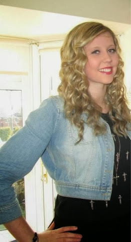
What do you think of the photo?
I really like this photo. This is because of the clear
direct address. I noticed that the photo was position higher on your first mock
up magazine, which did not look right. I agree that it was right to change this
and to bring the photo lower down. This is because it allows the characters
eyes to be looking directly into the eyes of the audience. You have clearly
followed the rule of thirds here by keeping the girls eyes central in the
middle third. This is good because it is the first place the audience look when
glancing at the magazine.
5.
What do you think of the structure and layout?
I love the way that the writing is position around the characters
face, it makes it look neat, tidy and shows the fact that you have considered
this carefully without making the magazine look untidy. You have made sure that
the masthead is shown to the audience clearly and you’ve made sure that it is
not covered by the photo, this is s good thing because it allows the audience
to know exactly what the make of magazine it is.
6.
What do you think of the text choice (lexical choice)?
I think by using words such as ‘Exclusive’ and ‘star’ we are
able to see the excitement in this magazine. It makes the audience think that
they must read this magazine because they are not going to find any of this
information anywhere else. It makes the magazine seem independent and full of
the most interesting information.