Monday, 25 November 2013

Modified Storyboard

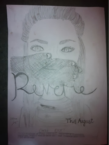
We have decided to change parts of the scene. This is the new update café scene. Today is the day we wish to get this filmed in order to have all the filming done and ready for editing!


Voxpop feedback

Here is a rough idea of our poster after hearing feedback from our peers. We deceided to have a close up on my face as after all, I is the main character in the film. However, instead of Susanna hugging into Terrance, there is a black figure in the backgroud to convey there is someone watching her every move. To bring out more features of film noir, we decided that their should be smoke around the characters to convey the gangsters presence and the title writing will be formed from the smoke. Therefore this idea, does not show a romance but a mistery, it shows the main character, the smoke makes the film mysterious and the writing no longer looks femine but creative.

This is an idea Steph had from the feeback

Wednesday, 13 November 2013

Updated Timetable

Date
What will be done?
Who will we need?
Props needed
4th/ 11/13
Narrative for the trailer
Steph or Emily
Video camera in a quiet room
6/11/13
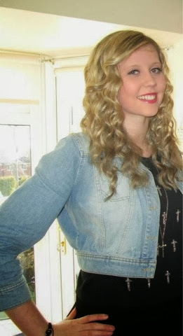
Pictures of the characters in costume
All cast
Outfits for the trailer
7/11/13
Pictures of the 3 gang members victims to be taken
Emily, Katie Stafford and Emily Mckeown
Camera
8/11/13
Picture of the pearl bracelet
The bracelet
Camera
12/11/13
The filming of the dream scene
Emily and Gareth
Video camera, characters in costume, dark lighting
18/11/13
Susanna tied up on a chair in a dark room
Emily
Video camera, low lighting, duct tape
18/11/13
Kidnap scene
All cast plus Mrs Chapman Jones
Van, characters in costume
18/11/13
Taking picture of Emily and Gareth for poster
Garth and Emily
Camera
18/11/13
Filming of Shoes
Gang cast
Video camera
25/11/13
The filming of the café scene
All cast
Video camera, characters in costume, 3 pictures of the victims, pearl bracelet

Modified Poster Design Ideas

We have decided to change the design layout of the picture on our poster. We have decided to change this because of another poster we have seen, which was created for a similar film. This poster came from the film Basic Instinct.


On this poster we liked the way the direct address attracted the reader’s attention, however it also showed the evil in the woman’s personality. She is looking directly into the camera which suggests that she is in control or has a large amount of power. This also looks dominant because of the way she is holding the male character. She is digging her nails into his back which suggests that she has this dominance because of the violence she appears to show.
 
For our film poster, we would like to have Terrance and Susanna stood like this, however in reverse position. We would like Terrance to look like the dominant one, and Susanna to look like the vulnerable one. This is because we have used a subvert of the typical film noir theme. We would also like Terrance’s red tie to be showing bright in the black and white photo. By having the photo in black and white (or with some effect) will show the conventions of film noir.
 
Below. we have shown a sketch to show what our new film poster should look like. This is very basic and some things have been put in the wrong place. For example, the title of the film (Reverie) will be in the bottom third of the poster. This is because it is less important than the picture itself.

Tuesday, 12 November 2013

Poster Analysis

Me and Steph decided to look further into more posters to decide how to portray ours to our audience.

Below is a poster from a film called whiteout. This is similar to our poster idea.
Here, the main aspects of this poster which appeal to the audience is simply the eyes and eyebrows of the woman. The eyes stand out so much evaluate of the way they are a very strong, light blue colour. The eyebrows also add a heavy focus from the audience because of the darkness contrasted with the white skin of the woman. I believe that we should think about including something like this on our poster because of the direct address and the way the poster attracts the audience immediately. Without this instant, eye catching point, the poster could be missed by the audience. This is very important for us to include this on our poster because of the link between audience and film. 

Another similarity to our poster plan would be the situation of the film title. It is towards the lower third of the poster because it would interfere with the photo if it was any higher. We plan to have our film title in the same place because of the way it still stand out, however it does not catch the audiences attention first. 'Reverie' is not a word which many people will know as it is a French word. Therefore, we know that there is no point in keeping the word as the main point of attraction. Instead, we would like to take a good picture which will catch more attention. 

The credit block at the bottom of the poster is something we would also like to include because of the way it informs the audience of other facts of the film. This will be of interest to a small majority of the audience anyway, however as the audience read the title, they may also be encouraged to read on in the credit block.

Update victim photos

Me and Steph decided that if the men were trying to kidnap the victims, they would not have pictures which look like they have been taken by the men themselves. Instead, we decided to use photos which the girls would want people to see. In the photos we would want the girls to be looking very well dressed and pretty which connotes the fact that the girls would use the photos for other things such as profile pictures (Facebook).

This is the new photo we will be using for Emily (one of the victims who is not chosen). 

This is the new photo we would like to use for Katie (another one of the victims who is not chosen).

This is the new photo we decided to use for me (Susanna). We specifically chose this photo because of the way I look and the way I am dressed. I am dressed smartly wearing a lot of jewellery and make up, which connotes the fact that Susanna is rich and can afford these privileges.

James Bond Poster Annotation

This is a poster to represent the James Bond film ‘Tomorrow Never Dies’. Many aspects in film noir can been seen throughout this film, even though film noir is not the main genre. An example of this could be the amount of femme fetale’s we see throughout the films. James Bond films are known for the heavy use of femme fetale’s throughout the film, just like we see in this film. However, they are not shown on this poster as the main focus appears to be James Bond and the gun only.
 
On the background of this poster, we see a great amount of black screen. This is there to connote the unknown in James Bond ‘Tomorrow Never Dies’. This is something we also see often in film noir (the unknown).
 
The red connotes the danger that this male will encounter when living his daily life. Danger is another thing often seen in film noir, meaning we have another link between this film and the theme of film noir. This could be similar to my poster because of the danger I wish to include. Susanna is pictured in the poster with a hand over her face to connote the fact she is being kidnapped. Since I have seen this on this poster, I believe I should include the amount of red I have on my poster. This will then show the danger she is about to encounter.
 
The way in which the credit block is displayed would be similar to my poster. This is because I believe I will include a credit block right on the bottom of my magazine. I will do this because this information is less important than the other information on my poster.

Monday, 11 November 2013

Location shots

As we had to change the location of the cafe, we decided to take new photos of the hub at at Bedes. This allows us to show the audience where the new cafe scene will be based

This is the round table the 4 males will be sat around when discussing the robbery and kidnap.

This is an establishing shot of the hub which indicates where we will be filming. You can see the counter in the background where Susanna will be standing when buying food.

This is the counter where good can be purchased.

Reservoir Dogs


This is the opening scene to reservoir dogs. I have chosen to look at this scene because of the way the men are shown as the camera tracks and pans around the men. This is a complicated shot as the camera moves around the men slowly to show each individual member. We have decided to use this in our film because of the way we need to define each member of the group (connoting their role using the mise en scene shown).


We have also decided that we may need to use an establishing shot at the beginning of the scene. This is to show the men sitting round the table together. We may also need to use this because we wish to show the cards on the table which shown the female faces. Because the panning / tracking shot would be at the table height, we may not see what is on the table. The previous shot needs to be at table length to show the authority that the men have, along with the power they are going to use.


We do not need to focus on the sound in the Reservoir dogs clip, due to the fact that we are mainly focusing on the camera angles used. We have also recorded a lot of our sounds already, and wish to record anymore we may need before filming. The idea of having the sound pre-recorded means that it will be clear on the trailer.


This is an example of the shot angle we may use. There are no people in this shot, however this is how we would expect to film.
 

Problems we have


The café closes at 4 - The problem we have is that we will not have enough time to get dressed and get to the cafe to film. To solve this problem, we have decided to use the cafe on the school premises to film this. There will not be any people in the café after school times, however this is not a problem, all because we do not need a lot of people there. We will also have a lot of time after 6th form to set up the hub to make it look more like a café.
 

The dream scene – As film noir does not usually use hand held cameras. We chose not to do this in our dream scene. Instead, we are going to use a point of view camera which will be strapped to Susanna’s person. This will allow the audience to see how it is in fact her own dream and she is being chased. There will be points in this scene where Susanna turns round to look at her killer (or the man she is being chased by). This, again, connotes the unknown.

Sunday, 10 November 2013

Poster Drawings

This is the poster we have been working on. I think this is a good example of something that we should use because of the detail shown within it. There are few layers on the poster, in the background there is a lot of dark space. This connotes the unknown behind Susanna and interests the audience into wondering what is going on behind we. In the mid ground, there is the large picture of Susanna. This allows the audience to see clearly, the woman involved. In the foreground, a photo graph of Terrance's hand is shown. This links in with the shock on Susanna's face and allows the audience to see how worried Susanna is, and the damage taking place when she is kidnapped. Overall, our poster is a working process and will include photos rather than drawings, however the basis are there and we have a clear idea of what we need to include.

Victim Photos

These are the photos of the chosen victims which will be displayed in front of the 4 males, on the table


Wednesday, 6 November 2013

Susannas Costume Ideas


Susanna is wearing a little black dress to connotate the unknown. This allows the audience to wonder what is going on in her life due to the fact that a lot of drama is present. It also makes her look innocent compared to the 4 men in black suits. Susanna will be wearing a pink lipstick which will also connote the sense that she is an innocent young woman.  
 
This is the jewellery that Susanna will be wearing. The pearls connote the fact that she is very rich and not scared to show it to others around her. This fact does not always get her the correct attention, considering the 4 males in the film are using this to their advantage when kidnapping her for her riches.

Cast Costumes


This is the cigarette we will use when showing the men sitting round the table. It is also a highly seen object featured in film noir, this is why we have included it in our film trailer. The cigarette is not a real cigarette, it is a fake one which lights up and produces smoke when you blow into it. This makes it acceptable for us to give to people to use, however it also looks like a real cigarette.


This is Terrance, he is wearing a red tie which connotes the theme of love and danger. He is the dangerous one as he is the main male who kidnaps Susanna for her money.
 
These shoes will be used to show the males walking towards us. These are Terrance's shoes.

This is Zipper. He is wearing a white shirt and a tie like the rest of the males. This makes him look like part of the group of males. On the other hand, Zipper is wearing a hoodie over this shirt. This makes him look more like the weedy character of the group. This connotes the fact that he is less intelligent than other members of the group and has less power than a lot of the other members in the group.

These shoes will be used to show the males walking towards us. These are Zipper's shoes.

This is Riff, he has his top button undone and no tie to represent how he is the leader of the group. He is also wearing a suit like the rest of the males to connote the fact that he is still part of the kidnap group members.
 
These are Riff's shoes.
 
This is Pepe, the geeky member of the group. He has black square glasses to represent the fact he is quite intelligent and provides the brains of the group.

Tuesday, 5 November 2013

Narrative Recording

Me and Steph recorded our narrative for our trailer today. We did various recordings and then Steph selected which sounded best. We decided it would be best that I did the narrative for the film trailer as I am the main charatcer and it can be as if I am telling my story, which makes the film seem more realisitic. We both decided that it would be best for me to put an American accent on as Film Noirs were orginally based in Amreica.

Saturday, 2 November 2013

Shutter Island 2


This is the second poster I have chosen to annotate for  the film 'Shutter Island'. I have chosen this film poster because of the colour scheme which has changed from the previous poster. I find this very interesting and cannot miss the fact that 'danger' is shown dramatically as a theme from this red colour. Everything here is red, showing that something negative and dangerous is going to happen within this film. As I have seen the film, I understand the level of negativity that is portrayed to the audience. The target audience for this film would be people who enjoy the psychology aspect behind the film. By showing the red colour, this encourages the audience to think about why this would be this way. This allows them to think about what could happen in the film from the trailer and the poster shown to them. Therefore, this colour scheme helps the audience to feel more involved int he film.

Leonardo Dicaprio is again shown on the front cover of this poster. This emphasizes the fact that he is the main actor and will be seen throughout the film in many different scenes. This allows the female audience to watch the film due to the fact that he is a very attractive male actor. Without this appearance from Leonardo Dicaprio, the film would not be able to attract the two different sexes in the audience. The film would be mainly focused on the male audience due to the level of violence and mystery involved. This allows the male actor to play an incredibly large part of attracting 50 percent of the audience.

The way in which Martin Scorsese's name is in bold letters attracts his audience straight away. Without thinking about the genre or theme of the film, an audience is already attracted just because of the directors name. Martin Scorsese is a very well know and experienced director due to the amount of films he has created in the past (for example Hugo or Gangs of New York). His audience will immediately wish to watch this film, knowing that they will be entertained. This is because they will have already watch many of his films in the past creating high expectations of the film he has recently directed.

Shutter Island 1

Shutter Island was a film I studied due to the interesting aspects of noir featured within the film. When I looked over the film trailer again, I thought it would be a good idea to include one of the posters in my research.


Unlike posters for other films, this poster appears to show a great deal of the colour black. This connotes how negative the film is, showing themes of danger and the unknown. This film includes an extremely complex story line which links with the connotation of the unknown from the colour black on the poster.

The way in which the match is lit suggests that there is some sort of investigation which needs to be solved. the male actors face is lit up showing a puzzled look. This allows us to understand even more that this man is involved in sorting some sort of mystery. This allows us to see how the psychological aspects attract an audience which looks for an unsolved crime or puzzle. 

As soon as we look at this poster, we see Leonardo Dicaprio's face lit up by a match. We immediately understand that the target audience for this film is females aged between 15 and 35 (simply because the film is rated as a 15 and Leonardo Dicaprio is not a young actor, meaning older generations would also be attracted to him). He is a very well known, good looking actor who is acting in this film to draw the attention of the female audience. 

The films title appears in red / orange coloured letters across the bottom of the poster. This indicates some sort of danger involved in the film here. We know there is some sort of danger from the trailer too, due to the fact we often see many scenes which show violence or weapons. The way in which the word 'Island' is present, suggests that there is a theme of being captured or trapped away from reality. This is exactly what is seen in shutter island. To emphasize this point, a blue sea is shown around the island itself. This suggest that there is no escaping for whoever is living on the island. The target audience will find this interesting due to the fact they are encouraged to wonder why this is. The main target audience for 'Shutter Island' would be people interested in psychology. This is because of the way the film is about a psychological mental hospital, however it is also because of the way the film includes a very complex story line which takes some thought to understand.